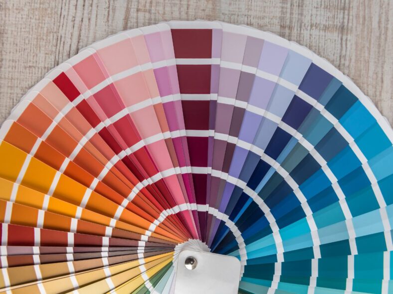
If you’ve ever seen a wall of 1,000s of swatches, you know how hard it can be to choose the right paint color. Can anyone even really tell the difference between Aegean Teal and Boca Raton Blue? Plus, how can you tell if the color you like will still look good after it’s covering your walls? There’s nothing worse than spending hundreds of dollars and several back-breaking hours rolling paint on your walls, only to find that you don’t even like it afterwards.
Color psychology can help you narrow down your paint choices!
Choosing a color for any room in your house goes beyond personal preference. Color can affect your emotions and even behavior. It can make you feel calm, energetic, or agitated. In this guide, I’ll show you how to use color psychology to create a space that perfectly suits the purpose of the room—and how you want to feel when you’re in it.
Table of Contents
- Introduction: Why Color Psychology Matters
- What is Color Psychology?
- The Psychology Behind Each Color
- Red: Energy and Passion
- Orange: Creativity and Excitement
- Yellow: Optimism and Energy
- Pink: Tenderness and Love
- Green: Balance and Freshness
- Blue: Calm and Focused
- Purple: Luxury and Imagination
- White: Clean and Spacious
- Gray: Neutral and Modern
- Black: Bold and Elegant
- Room-by-Room Paint Color Psychology Guide
- Living Room: Create a Welcoming Atmosphere
- Bedroom: Promote Rest and Serenity
- Kitchen: Bright, Fresh, and Active
- Home Office: Boost Focus and Productivity
- Bathroom: Refresh and Relax
- Dining Room: Encourage Conversation and Appetite
- Tips for Selecting the Right Paint Shade
- Common Color Mistakes to Avoid
- Conclusion: Choosing Colors with Confidence
What is Color Psychology?
There’s a reason why bedrooms tend to use muted colors, while supermarkets tend to blast you with bright colors like red. Softer colors can make you feel relaxed, while vibrant shades can boost your energy or even make you feel agitated. We humans respond to each color in different ways. While color psychology is still an emerging science, there’s some evidence that color can help lower stress, improve sleep, and more.
There are all kinds of different paint color categories, but the first and most basic one you need to understand is “warm” vs. “cool” tones. Think of your old friend ROY G. BIV—the colors of the rainbow. Red, orange, and yellow make up the warmer tones, while green, blue, and purple are considered cool. (Yes, you can find cool versions of warm colors, like a blue-ish red, but that’s a blog post for another day!)
Warm tones are like fire—they bring to mind passion, energy, and warmth. Cool colors are the opposite. They can inspire relaxation and focus. Ever been to a spa or therapist’s office? They usually use cool colored paint to make clients feel relaxed and comfortable.
The Psychology Behind Each Color
Every color has its own psychology that evokes emotions and affects how we feel and behave. The effect of a color on you may be different depending on your cultural background, personal association, even your belief in the color’s effect.
Here’s a breakdown of what each colour can communicate, how it can affect your body, and how you can use them in your home.
Red: Energy and Passion
Red is a strong, stimulating color that can bring up strong emotions like excitement, passion or urgency. It can make you breathe faster, speed up your reactions and heart rate, and even raise your blood pressure!1
Red paint is great for areas where you want to energize, like dining rooms or home gyms. In fact, red is the most common color used in the food industry! But too much red can be overwhelming. Use it sparingly or as an accent.
Orange: Creativity, Youth, and Excitement
Orange combines the energy of red with the optimism of yellow. It’s uplifting and creative. It can also make you feel competitive and even physically stronger! It’s great for workout rooms, art spaces, or playrooms. But it’s probably too bold for spaces where you want to chill.
Also keep in mind that it’s the color most often chosen as people’s least favorite color, so you may not want to paint your hosting spaces orange.
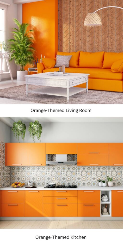
Look at this photo of the orange accent wall in the living room. Is this the kind of space that would make you feel relaxed? For most people, the answer is no. (But if that’s your style, go for it!) The orange feels more appropriate to me in the photo of the kitchen, where you’d want to feel lively.
Yellow: Optimism and Energy
Yellow is warm and happy, and it often brings up feelings of sunshine and positivity. It can also raise blood pressure and make your heart beat faster, but not to the same extent as red. Yellow paint is great for kitchens or playrooms, but be careful. Too much bright yellow paint can be overstimulating or even frustrating for some people.
Pink: Tenderness and Love
People often think of pink as loving, kind, and nurturing. It can even reduce signs of physical aggression. A Navy detention city in Seattle found that angry prisoners became calm after only 15 minutes in a pink cell. After noticing this, jails began using pink to calm down aggressive prisoners!3
Softer shades of pink create a calming atmosphere that can be good for bedrooms or nurseries. Brighter pinks like “hot pink” or fuschia can add energy and playfulness to a room. That can work really well for creative spaces or accent walls.
Green: Balance and Freshness
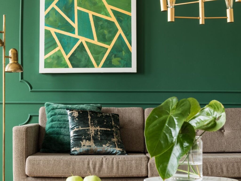
Green makes us think of nature, harmony, and renewal. It can boost your mood when you’re feeling down and slow down your heart rate.4 Green can also symbolize independence and inspire you to make changes.
Green’s versatility makes it a great choice for any room, from living spaces to home offices. Softer greens are calming, while brighter greens are energizing. Be careful: shades of green paint that are closer to yellow can be agitating for some people.
Blue: Calm and Focused
Blue is most popular favorite color in the world! It’s the go-to “education” color because of its association with wisdom. It calls to mind serenity, trust, and focus. Lighter shades create a calming space, perfect for bedrooms or bathrooms. Darker blues can make you ready to concentrate, which is why they work well in offices or libraries. A word of warning: too much exposure to darker shades of blue can make you feel, well, kind of blue.5
Purple: Luxury and Imagination
Purple has been associated with royalty, sophistication, and creativity in many cultures for centuries. It was adopted by the women’s suffrage movement and is often used to reward bravery, as in a “Purple Heart.” Light lavender tones are calming, perfect for bedrooms, while deep purples add drama and glamor to living rooms or dining areas.
White: Clean and Spacious
White is a classic choice for a clean, open feel. It’s strongly linked to innocence and new beginnings, and it can enhance focus and memory in working spaces.6 It’s clear and simple, great for kitchens, bathrooms, and small spaces that you want to feel bigger. You can easily pair white with pops of color to add personality. Too much bright white can feel harsh, though—think “hospital room” vibes.
Gray: Neutral, Modern, and Mature
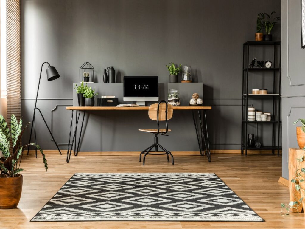
Gray is a neutral that can feel warm or cool depending on its “undertones,” or its underlying colors. It can be hard to see the undertones of a single color, but if you hold it up next to another color or shade of the same color, it can become more apparent. While gray can feel bland and “cookie cutter,” it can also be sophisticated and balanced. Darker shades of gray paint can feel moody and dramatic, while lighter shades can feel more easygoing. It’s great for living rooms, offices, and modern spaces.
Black: Elegant, Bold, and Sometimes Negative
While many people associate black with sadness or aggression, it can adds depth, drama, and a sense of luxury when used sparingly. Most people find that it’s too heavy for full walls in most cases, although you’d probably disagree with me if you are a gritty gym or a tattoo shop! In homes, it works beautifully as an accent color or for furniture and trim.
There are plenty more ways I could categorize colors for you, but I know you’re interested in how paint colors affect your living space. So I’ll cut to the chase by giving color psychology tips that can help you choose a paint color for each room in your house below.
Room-by-Room Paint Color Psychology Guide
When thinking about which paint color to choose for any room in your house, keep in mind the following question: How do I want to feel when I’m in here? Considering whether you want to feel relaxed or energized can help you rule out tons of colors by process of elimination.
Living Room: Create a Welcoming Atmosphere
The living room is the “heart” of your home. It’s for relaxing, family time, and entertaining guests. Neutral tones like beige, taupe, and light gray can help create a cozy backdrop for all kinds of activities. These colors pair well with many different styles of furniture and decor, so you can easily refresh the look of your space without needing to repaint. For an even more inviting touch, use soft greens or warm earth tones. These can bring to mind feelings of nature and comfort.
I remember one of my past clients wanted a color that felt inviting for their frequent movie nights and book club gatherings. We chose a warm beige paint color. Afterwards, the space felt calm and adaptable. The family shared how everyone complimented the soothing vibe of their living room.
Bedroom: Promote Rest and Serenity
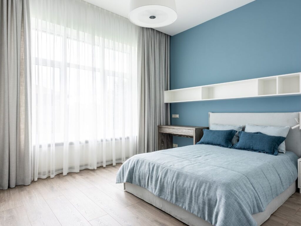
Your bedroom is your sanctuary, and the right colors can help you wind down and sleep better. Calming tones like pastel blues, soft lavender, and muted greens are great for promoting relaxation and reducing stress. Cool tones can lower your heart rate and encourage a peaceful atmosphere. To create a truly restful space, avoid bold or overly bright colors, which can be stimulating.
For bedrooms, I almost always recommend blue. It may not be the most scientific reason, but everyone I know that has a blue bedroom swears it helps them sleep better.
And actually, a study of 2,000 homes found that people who sleep in blue rooms get more sleep than in other colored rooms!7
Kitchen: Bright, Fresh, and Active
If you’re anything like me, the kitchen is where you make core memories with your family. You want it to be a place that feels energized, stimulating, and fresh. While you might want other areas of your house to be more subdued, the kitchen is where you can get a little bold with your paint color choices, if that’s your thing.
Bright yellow paints are a good choice for a kitchen, since they can stimulate appetite (and maybe even make you feel motivated to cook after a long day of work!). For a softer vibe, creamy whites and sage greens can feel fresh, clean, and “culinary.”
On one of my favorite kitchen projects I worked on for a client, we painted the walls a vibrant yellow and the cabinets a crisp white. It felt inviting and modern at the same time.
Home Office: Boost Focus and Productivity
A home office should make you feel concentrated and creative, not distracted. If you work in a creative field like design, you might choose bold colors to feel inspired. But for most people, this is going to mean soft blues, muted greens, and neutral grays. Blue can make you feel more productive and less stressed while green can adds a sense of balance. I would avoid warm tones, which can feel distracting in a workspace.
One of my clients was a freelance graphic designer who spent hours each day in his home office. He wanted it to feel professional but not sterile. We painted his office in a muted gray-green. The color brought a calming vibe to the space. He told me it helped him stay on task and inspired during his workdays.
Bathroom: Refresh and Relax
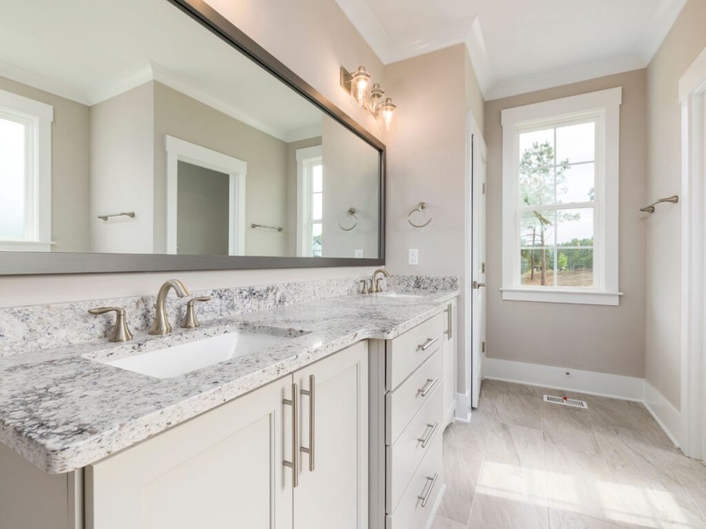
The bathroom is where you get your day started and do your evening routine. Most people want a bathroom that makes them feel calm and refreshed. Pale blues, aqua tones, light grays, and crisp whites are all great for turning your bathroom into your personal spa retreat. These cool tones reflect light and make the small space feel bigger. If you want a modern look, you can pairlight walls with darker tile or trim for contrast.
Dining Room: Encourage Conversation and Appetite
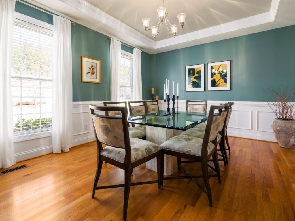
The dining room is a stage for lively conversation and connecting with others. Paint colors like deep reds, warm oranges, and neutral tans work well here. As I mentioned earlier, red is known for stimulating appetite and energy. Warm neutrals make a room feel sophisticated but don’t overpower it. If you want a bold look, you can do a bright orange or deep red accent wall.
Tips for Selecting the Right Paint Shade
Test Swatches
Tape samples on the wall to see how they look in different lighting throughout the day. Do this one sample at a time. Don’t pin multiple swatches next to each other unless you plan to use them together, because colors can take on a different look when compared to other colors next to them.
Consider Your Lighting
A lot of people overlook this, but a color can look completely different depending on the lighting. A shade that looks perfect in the store or on a swatch might look entirely different under the warm glow of your living room lamps or the natural light of your kitchen window.
Take into consideration the natural lighting of the room if there are windows, or the light from whatever fixtures you have in there. A darker shade might look great in your mind’s eye, but you wouldn’t want to use it in a space with harsh LED lights.
Consider Undertones
A seemingly neutral color can have warm or cool undertones that affect the overall mood. If you’re having trouble seeing the undertones, hold the swatch up next to different objects and see if it “matches” them.
Think About Your Furniture
Make sure the wall color complements the decor you already have or that you want to get
Start Small
Experiment with bold colors in smaller spaces like a bathroom or an accent wall before committing to larger areas.
Common Color Mistakes to Avoid
Choosing the perfect paint color for your space can be exciting, but there are a few pitfalls to steer clear of to ensure your final result is exactly what you envision:
Don’t Overwhelm Small Spaces with Dark Colors
Deep or dramatic hues can be elegant, but they can also make small rooms feel cramped and closed in. For smaller spaces, I recommend lighter tones to help reflect the natural light and create a more open feel. Use the darker shades on accent walls or larger rooms where they can pop without overpowering.
Don’t Fall for Trendy Colors That Don’t Match Your Style
Trends come and go. Every time I went into my grandma’s living room with pink carpet and floral couches, I used to think, “This just looks so…old.” But all of that was in style at one time. Always choose the harmony of your space over the latest fad.
Don’t Ignore How Lighting Affects the Final Look
Lighting affects how colors appear in your home. Test your chosen colors in the room’s actual lighting before committing to ensure they work as intended. If you absolutely love a paint color but it doesn’t jive with your lighting, it might be time to install new lighting fixtures!
Final Thoughts on Color Psychology for Paint Selection
Choosing the perfect paint colors is easier than you think. When you understand color psychology and how it impacts emotions, you can design a home that suits you. The right colors can really go a long way—I’d say most of the way—for creating a welcoming, energizing, or calming environment.
Remember to test swatches, consider lighting and undertones, and make sure your paint complements your existing furniture. Avoid common mistakes like overwhelming small spaces with dark colors or chasing trends that don’t fit your style. Hopefully now you’re ready to choose your paint with confidence and turn your home into a sanctuary!
- Color red increases the speed and strength of reactions
- Colors Influence Mood
- What Does the Color Pink Do to You?
- Adaptive Effects of Seeing Green Environment on Psychophysiological Parameters When Walking or Running
- The Power Of Color Therapy: Understanding The Basics
- Interior Color and Psychological Functioning in a University Residence Hall
- The secret to a good night’s slumber is to sleep in a blue bedroom